Why is Tinder seductive?
Estimated reading time: 3 minutes (ish)
Tinder is currently the world’s hottest dating app with millions of users who participate in billions of interactions. Why is it addicting? It’s designed to be that way.
The first notable feature is Facebook login. Not only is the registration instant, the app leverages all of the social features of Facebook for its own purpose. Things like mutual friends and mutual likes are very good icebreakers when you message the person you like. Further addition of Instagram photos give a more rounded profile.
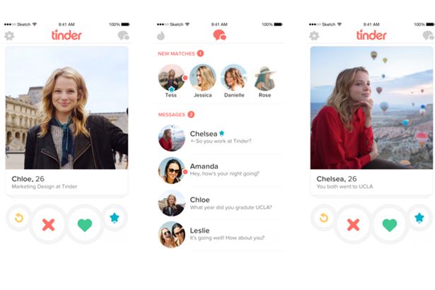
Swiping right to like someone while swiping left to dislike are very intuitive movements and it is also guilt free. Some female users do it so fast that other people around her wouldn’t be able to keep up with the photos. If there was a mistake of swiping left on a hot guy, you can rewind your decisions. How convenient!
Occasionally you will encounter incredibly beautiful men and women on the app and this creates a fear of missing out if you stop using it. Your brain now knows that there are millions of beautiful potential mates out there and Tinder is the best way to see and judge them. The passport feature in which you can search in any location around the world compound this effect even further. It creates a feedback loop in which you can’t escape easily.
Another addicting element of Tinder is making your own profile. You need to creatively convey who you are in just 400 words and 6 pictures. The first photo is indeed the most important since most users swipe right or left just by looking at the first picture without bothering to even check at the description. With constraint comes infinite possibilities. Would you put your inspirational quote? Humorous remark? Sarcasm? Or a more detailed description of your hobbies? What would be the perfect profile to get as many girls as possible? A lot of research and testing may go into a very good profile. Guess what? By doing all of that, you are spending a lot of time on the app.
The most powerful way Tinder keeps its users glued to its app is by creating impatience. For free users, 100 swipes and 1 super likes are permitted every 12 hours. 100 swipes are indeed a lot but the user doesn’t know when he will run out as there are no indication. Often it will run out when he is about to like a hot girl and he can’t anymore. This creates a little anger and ironically more attraction towards the app. As 12 hours are counting down, he will keep checking when it will end so he can start swiping again. Due to this, many users pay to end this effect so they can have unlimited swipes or keep suffering the effect of impatience.
When you swipe right on a gorgeous woman and she also did the same, the app will suddenly tell you that you are both a match. When this happens, dopamine floods your system and you become both anxious and excited. “Geez, what should I message her?” You will think about this all day. For some it will lead to casual dates. For others fulfilling relationships. For most people, the match will end in a disappointment because the other person doesn’t usually reply. So what now? Swipe some more!
The darker side of Tinder’s addiction is that some women and men measure their self-worth by counting how many matches they get. It creates a fleeting sense of accomplishment. At the end of the day it feels empty. However, this is just one reason out of many to keep using the app.
In conclusion, the elegance of Tinder’s design is that it is simple, clean and intuitive. Although there are a lot background features acting at the same time to create an overwhelming addiction, the app never confuses the user on what to do next. Its competitors like Badoo try to copy Tinder’s model but overwhelm the users with too many features to remember. You need to think carefully what kind of motivations your features are producing in the users and how do you amplify its effects with other features. Sometimes less features that work well together is much better than lots of features which may or may not work together.
